HOBART INTERNATIONAL AIRPORT
PARKINGPLUS STRATEGY, POSITIONING & CAMPAIGNING
HOBART INTERNATIONAL AIRPORT
Brief
The brief was simple; how do we improve airport parking perception and performance. Many people don’t park at the airport because it is negatively perceived in market as expensive and inconvenient.
Solution
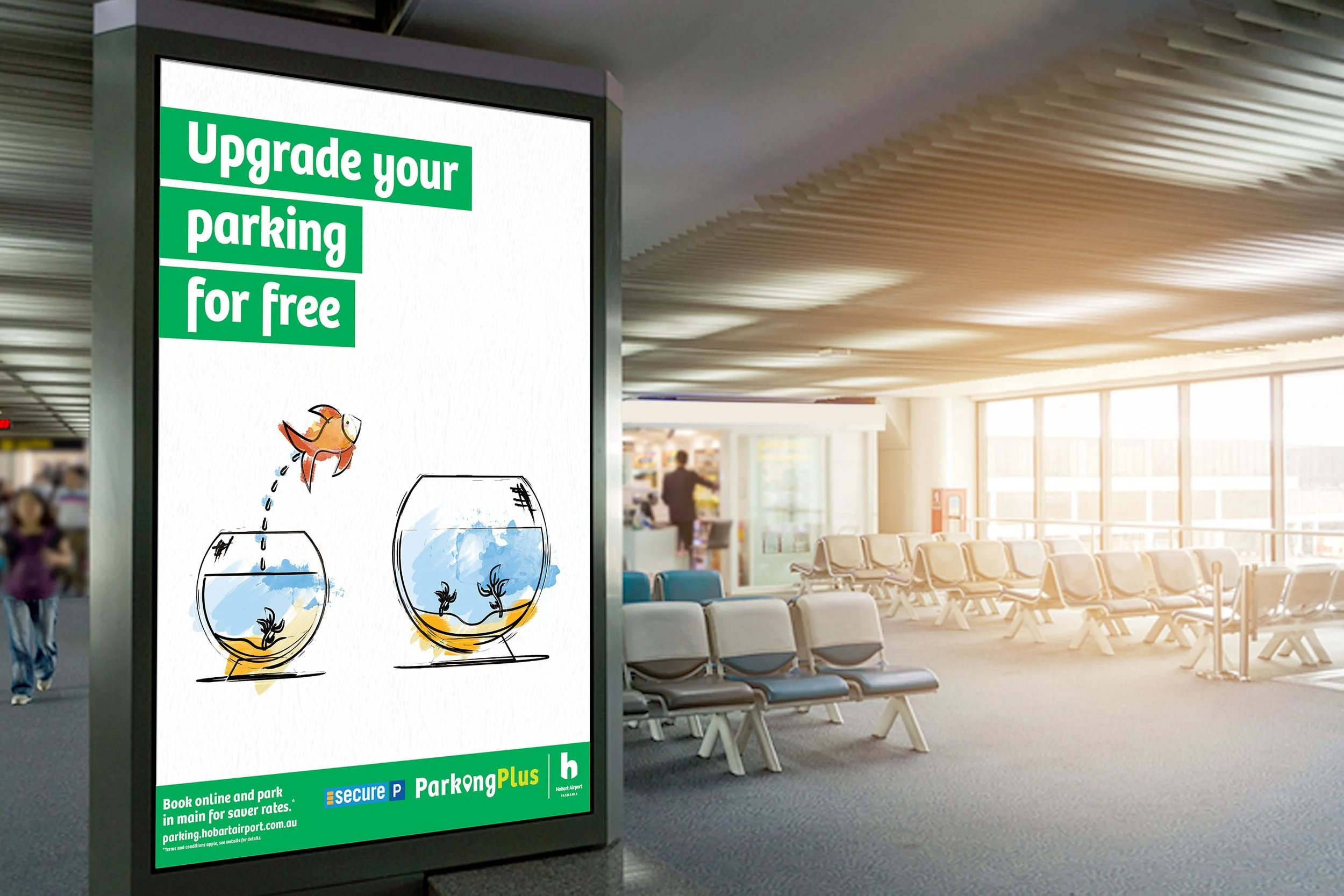
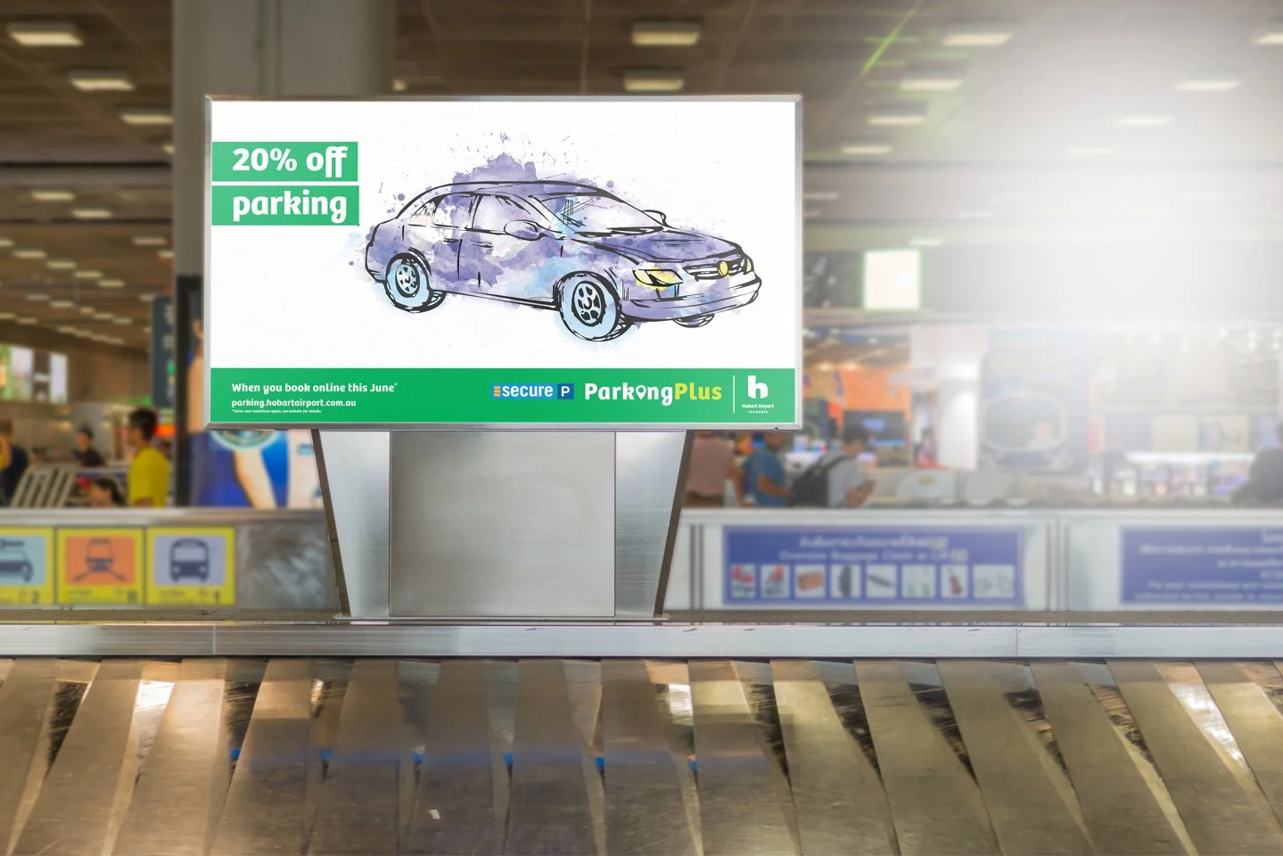
We want to disrupt the perception that airport parking is costly and inconvenient. We needed to intercept strong negative emotions towards cost, to do this we developed a car parking specific sub brand, ParkingPlus. The creation of an overarching car parking message with longevity that can be incorporated into smaller tactical campaigns throughout the year enables repetition, which yields a higher level of brand recall.
The ParkingPlus positioning is a value ad statement that takes the conversation away from just cost. We used emotive language and imagery to illustrate that it’s about more than just parking; it’s ParkingPlus. The ParkingPlus lock up is reminiscent of the master Hobart Airport brand with the introduction of a parking specific colour and destination pinpoint icon to create relevant visuals cues. We shot on location to capture emotive images for use in our ParkingPlus launch campaign that articulates the story of ParkingPlus and establishes the new positioning in market.
Result
A new and consistent identity for Hobart Airport’s parking offering has been achieved and well received. The ParkingPlus brand campaign launched in October across digital, radio, press and onsite signage. The results of this new positioning will become even more evident over the next 12 months as we continue our consistent reinforcement of the ParkingPlus messaging through all parking communications and campaigns.
Services
Brand Strategy, Branding, Campaign Creative, Content Creation, Media Planning & Buying


