CUSHMAN & WAKEFIELD
420 ST KILDA ROAD
CUSHMAN & WAKEFIELD
Brief
Cushman & Wakefield engaged Red Crayon to create a suite of sales assets to showcase the recently renovated 420 St. Kilda Road, Melbourne building to potential investors. Cushman & Wakefield asked that the key piece, the bespoke Information Memorandum be inspired by the building’s newly renovated fit out, the asset now had much more to offer.
Solution
420 St. Kilda Road, is a premier building in a prime location boasting a true sense of style with the sophistication expected from an asset of this caliber. With this in mind Red Crayon designed a unique concept, representing the asset in a sophisticated, modern and clean medium.
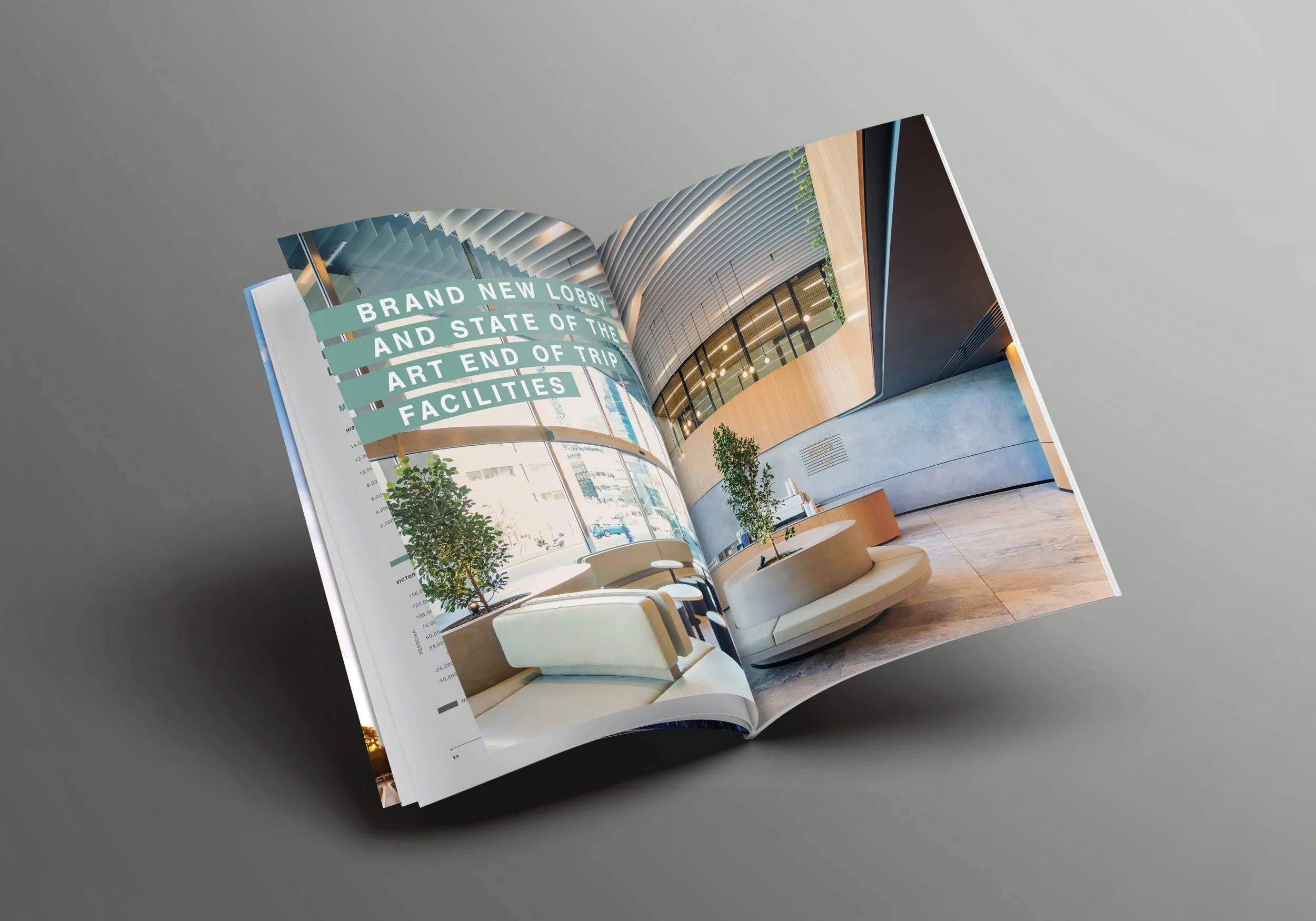
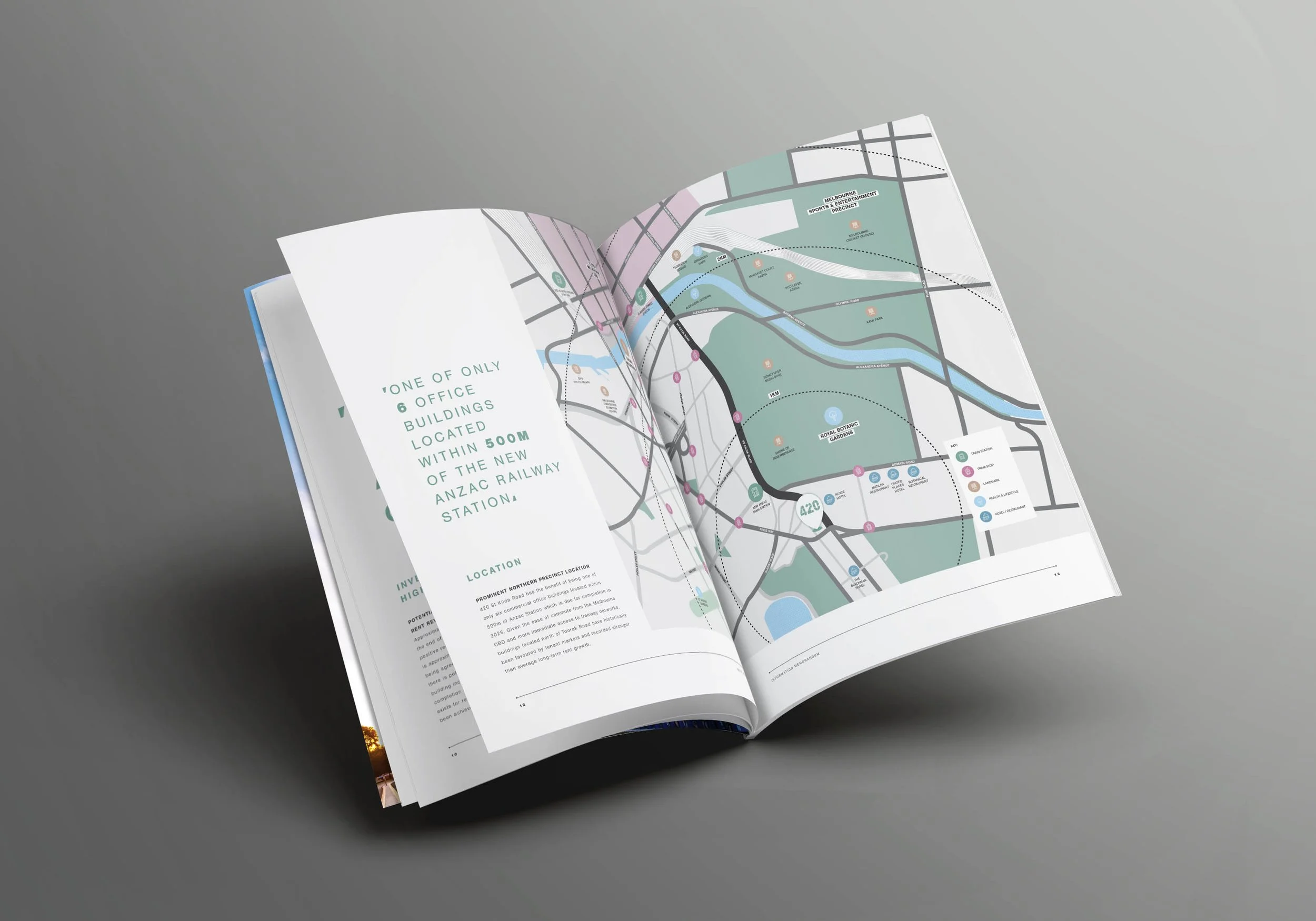
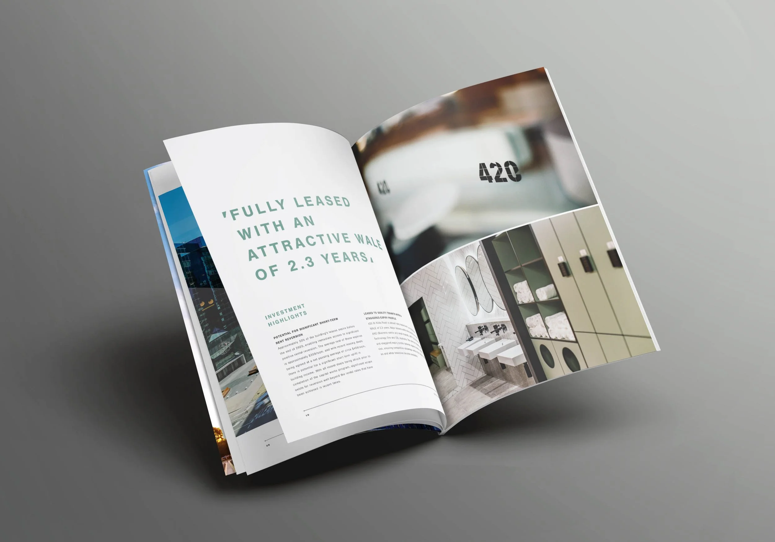
Influence was taken from the materials, shapes and structure of the buildings refurbishment and implemented throughout the bespoke design. The colour palette is restrained; the typographic treatment modern and considered with ample ‘white space’ allowing the building images to take centre stage and visually reinforce the sophistication of this asset.
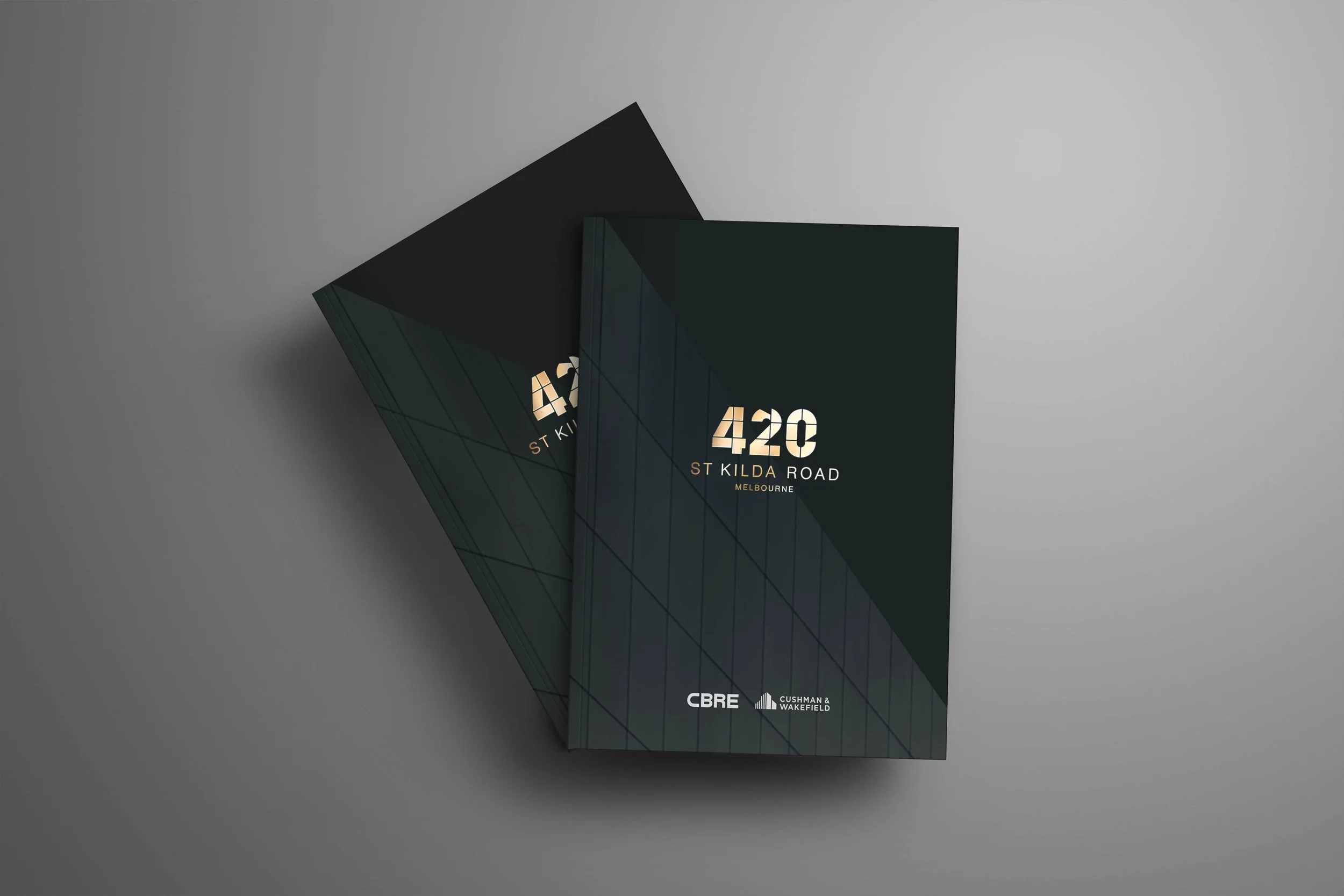
The minimalistic cover utilises the shapes and abstract applications of the buildings exterior while the gold foil accents and premium finishes reinforce the superior asset that is on offer.
Services
Branding & Collateral Design
