Tiffany’s Kitchen
BRANDING & PACKAGING
TIFFANY’S KITCHEN
Brief
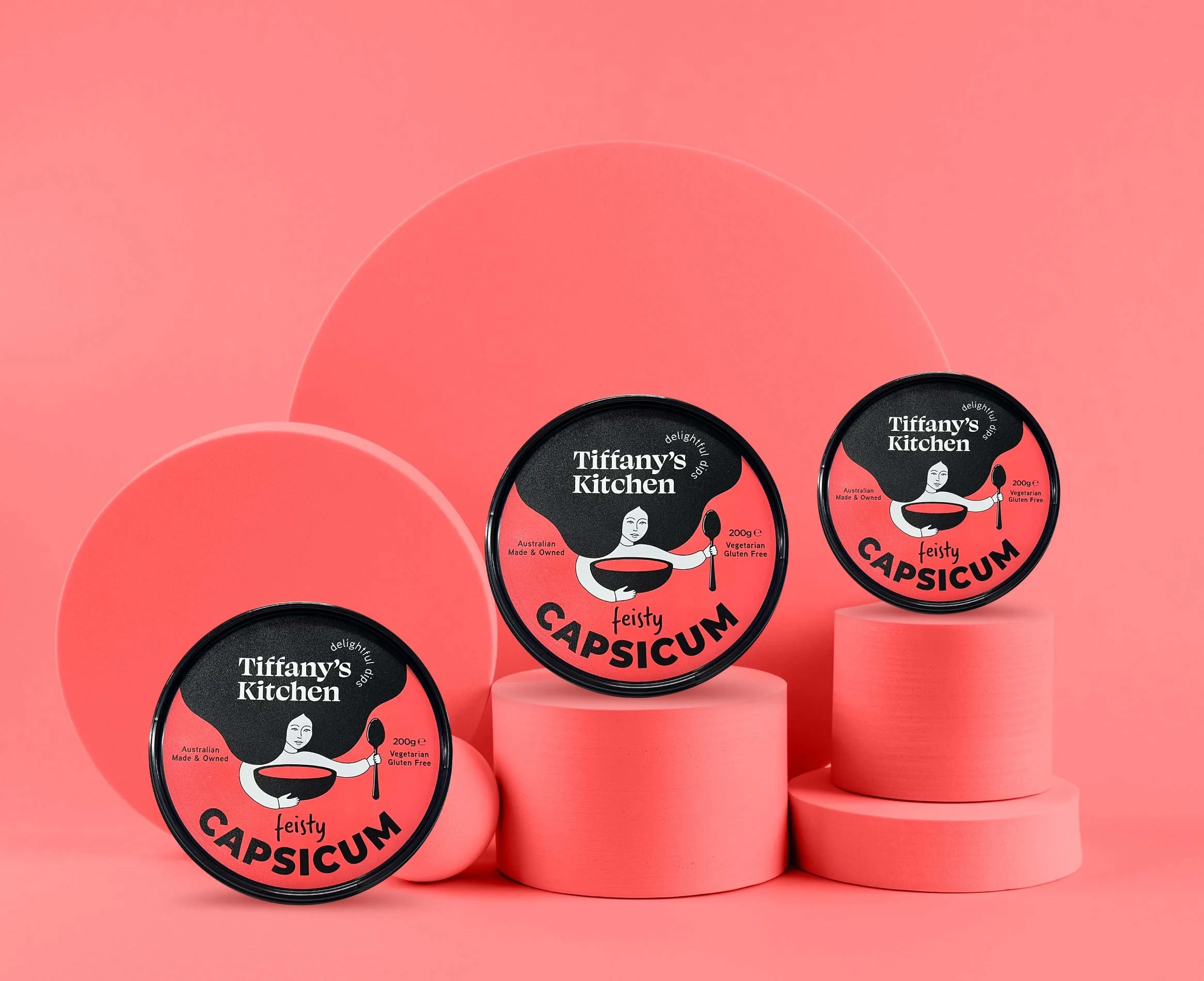
Tiffany’s Kitchen approached Red Crayon to assist with the development of a new dip brand they are launching into Woolworths to fulfill a gap in the market. The brief was to create a logo, style guide and rollout packaging for Tiffany’s Kitchen which would need to appeal to younger female audience whilst not alienating the broader shopper demographic.
Solution
Through strategic interpretation of the brief, we developed concept logos and colour palettes for collaborative discussion with the client. We explored modern and traditional styles and landed on a current and trending illustration style, which features long flowing hair as a key feature in the design. To complement the ‘on trend’ style, we include a bold yet edgy serif typeface which pairs with a complimentary simple and elegant cursive font subtly alluding to the line weight present in the illustration. This results in a bold and quirky brand, whilst also being simple and elegant.
The approved branding was then rolled out across 6 products including the development of a sku based colour pop palette and cute and quirky product names to set the brand apart from competitors on shelf.
Result
The range launched successfully in Woolworths late September. We are looking forward to continuing to work with the Tiffany’s Kitchen team and stay tuned for an upcoming launch campaign!


